
The Objective
Bayer needed a focused idea for Xarelto that reassured clinicians they could prescribe with confidence. They wanted a clear, authoritative message around its proven profile, cutting through category caution to position Xarelto as the dependable choice in anticoagulation — strengthening trust at the moment prescribers needed certainty most.

Creative Solution
We built the campaign around a single, powerful metaphor: the carabiner — a symbol of total reliance in extreme conditions. Its rich visual world helping to reinforce Xarelto’s dependable profile. The carabiner quickly became a brand icon at trade‑shows and in mail packs, and the campaign earned multiple industry awards, including recognition for photographer George Logan.

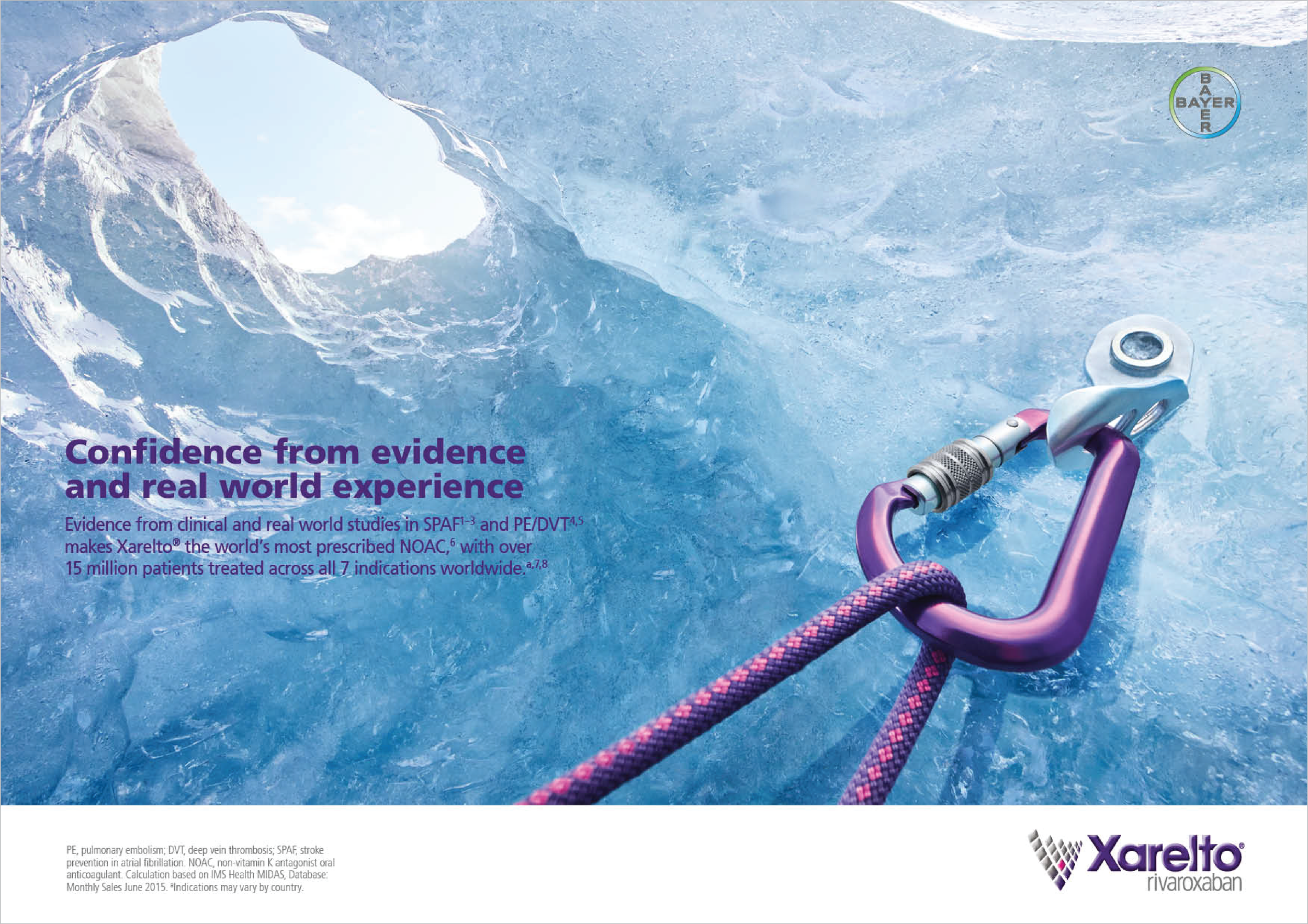
Press ads
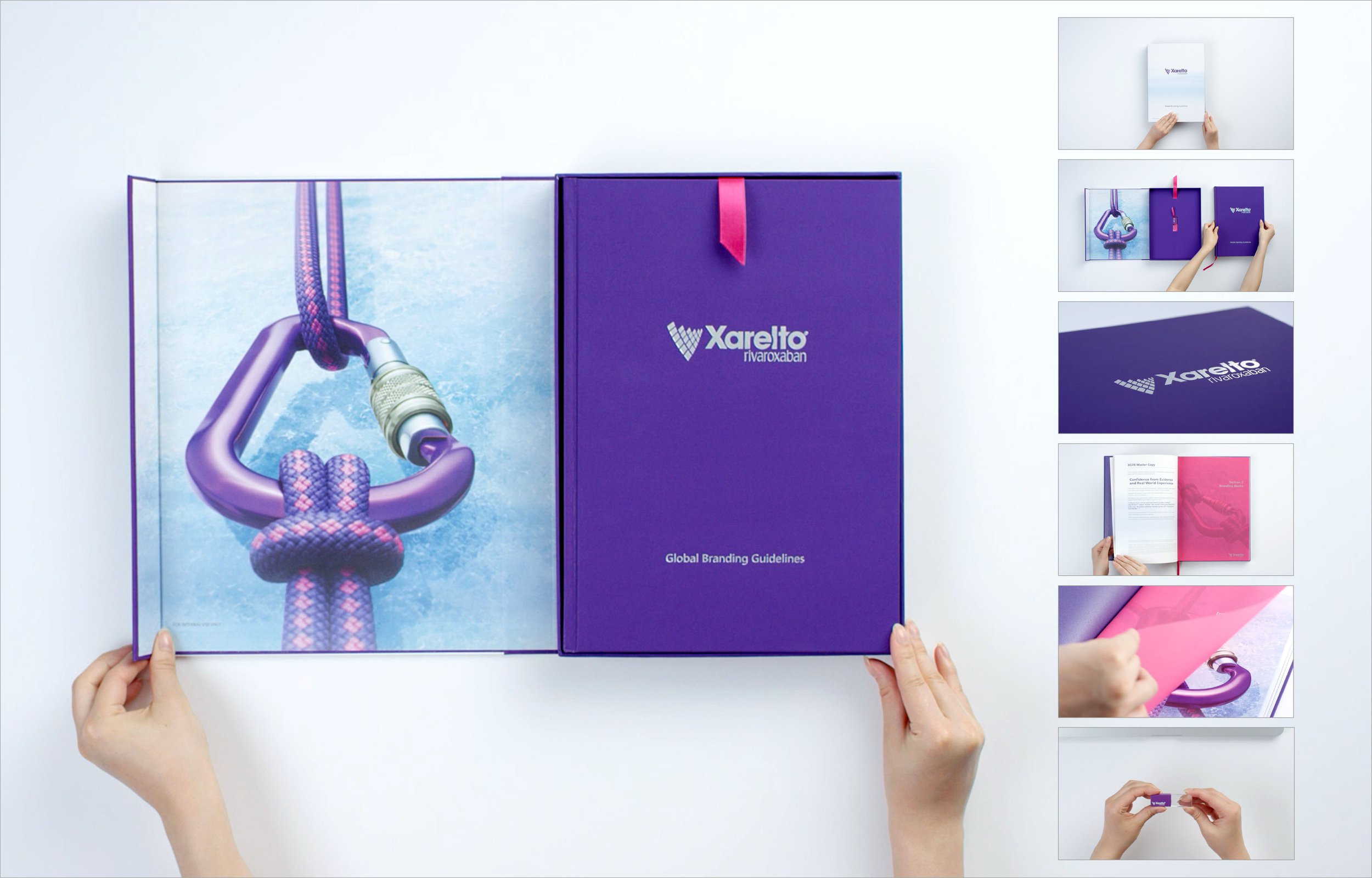
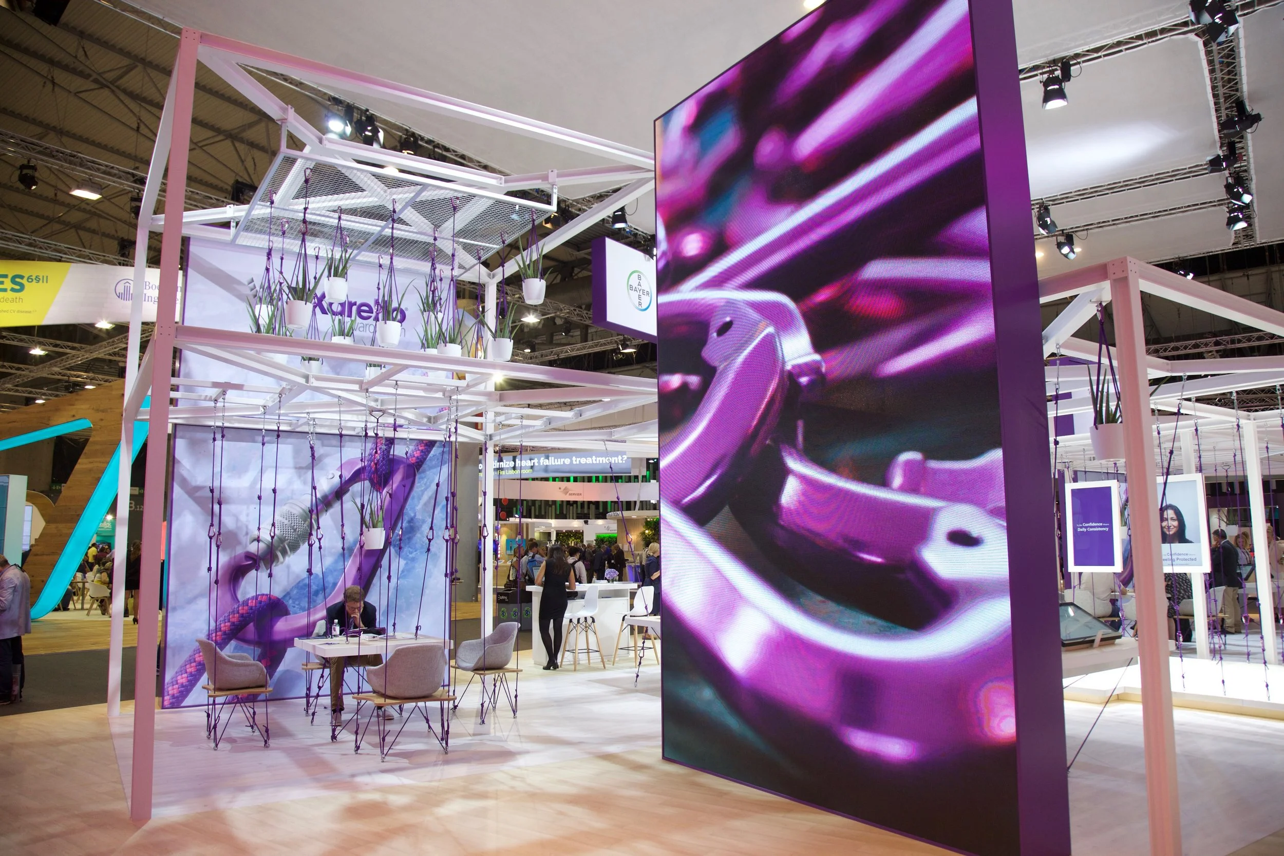

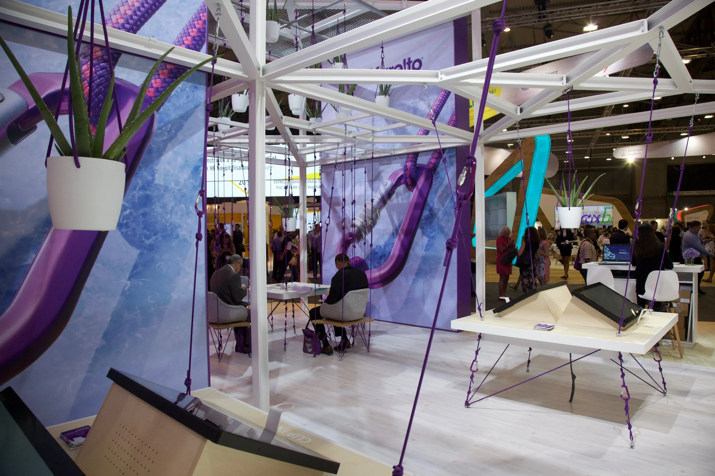
Brand Book and Trade Show Stand
The Objective
Diagnosing MF‑CTCL is challenging because its early signs often mirror far more common skin conditions, leading to years of uncertainty and delayed referrals. The strategy was to spotlight this diagnostic confusion with clarity and empathy, positioning Ledaga within a more confident, informed pathway for recognising this rare disease earlier.

Creative Solution
We tackled the MF‑CTCL challenge by using nature’s look‑alikes, objects that seem alike but are fundamentally different. These sharp comparisons mirrored how MF‑CTCL can resemble common skin conditions. The concept delivered instant clarity for clinicians and a striking, memorable way to underline the importance of recognising subtle diagnostic differences.
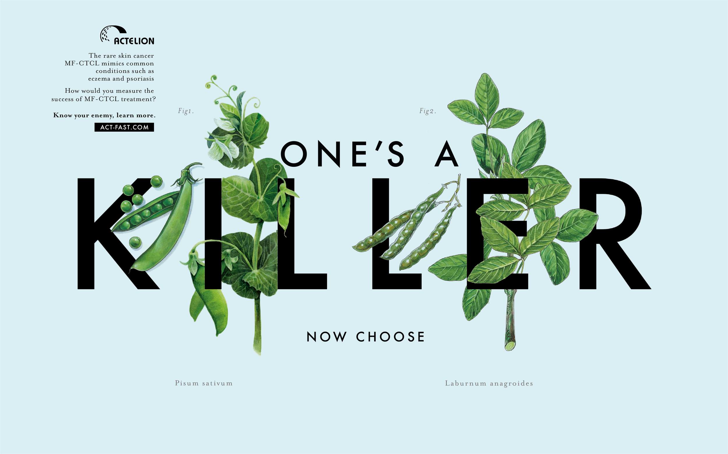
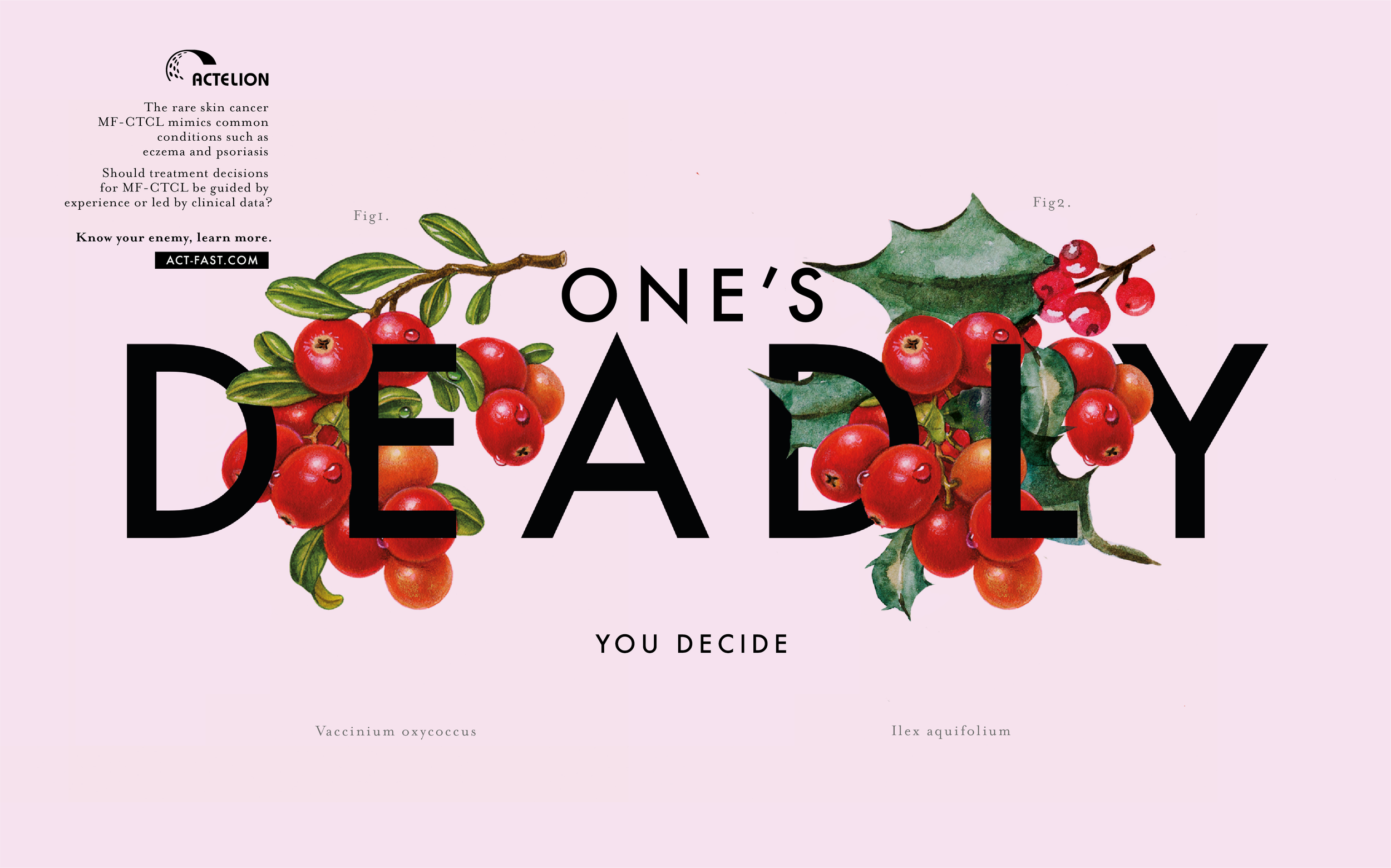
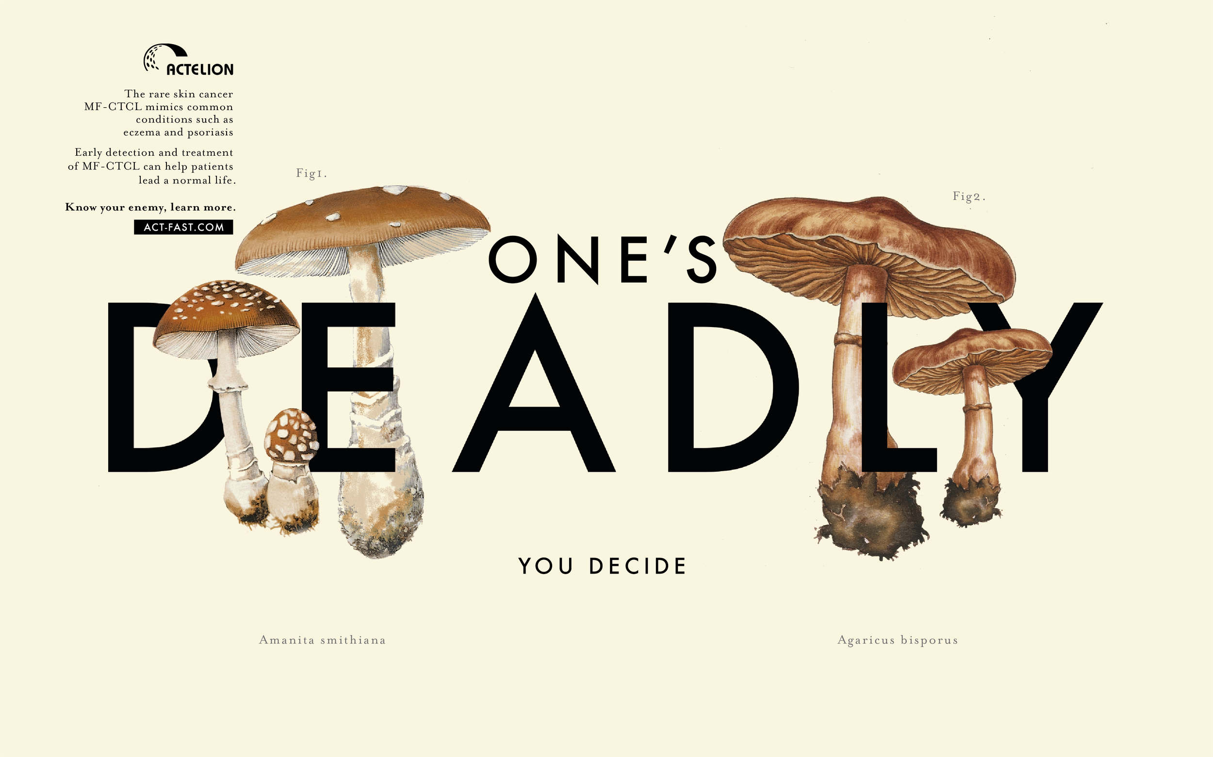
Launch campaign Press ads
Creative Solution
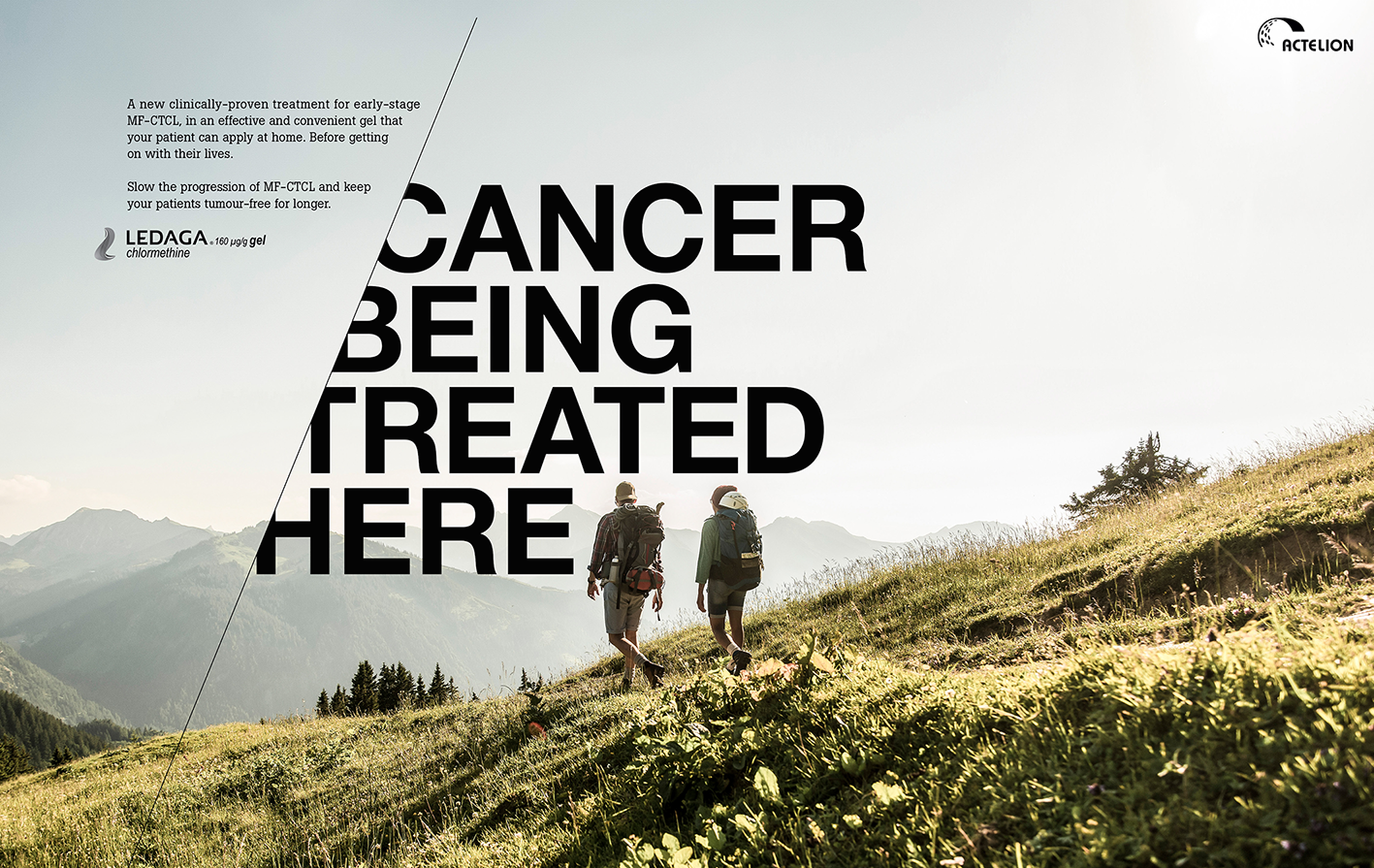
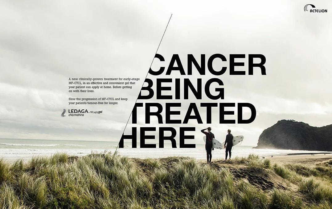
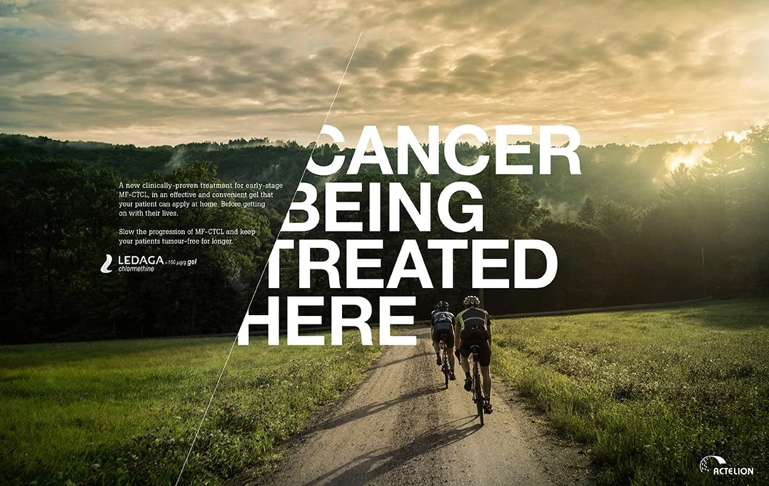
We centred the idea on the treatment’s core advantage: letting patients get on with life without constant hospital trips. The campaign showed people enjoying meaningful life moments while confidently managing their therapy — a simple, human device that reframed treatment as genuine freedom and continuity rather than disruption.
Second campaign Press ads
The Objective
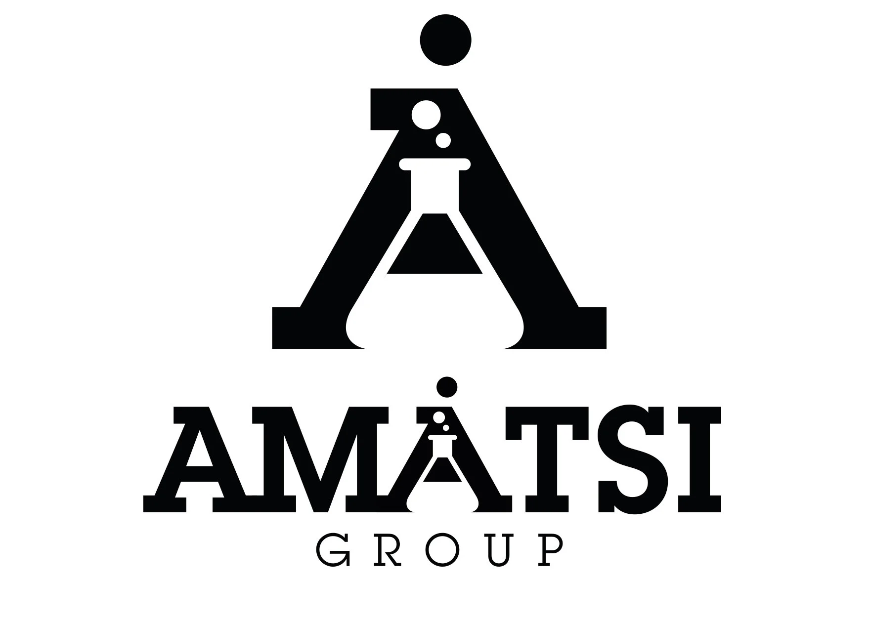
This was a pure graphic design exercise when the Amatsi Group needed a modern, future‑ready identity to reflect their evolution into a global CDMO. The strategic task was to replace a dated corporate image with a clearer, more confident brand that matched their scientific capability and signalled a contemporary, agile organisation.


Creative Solution
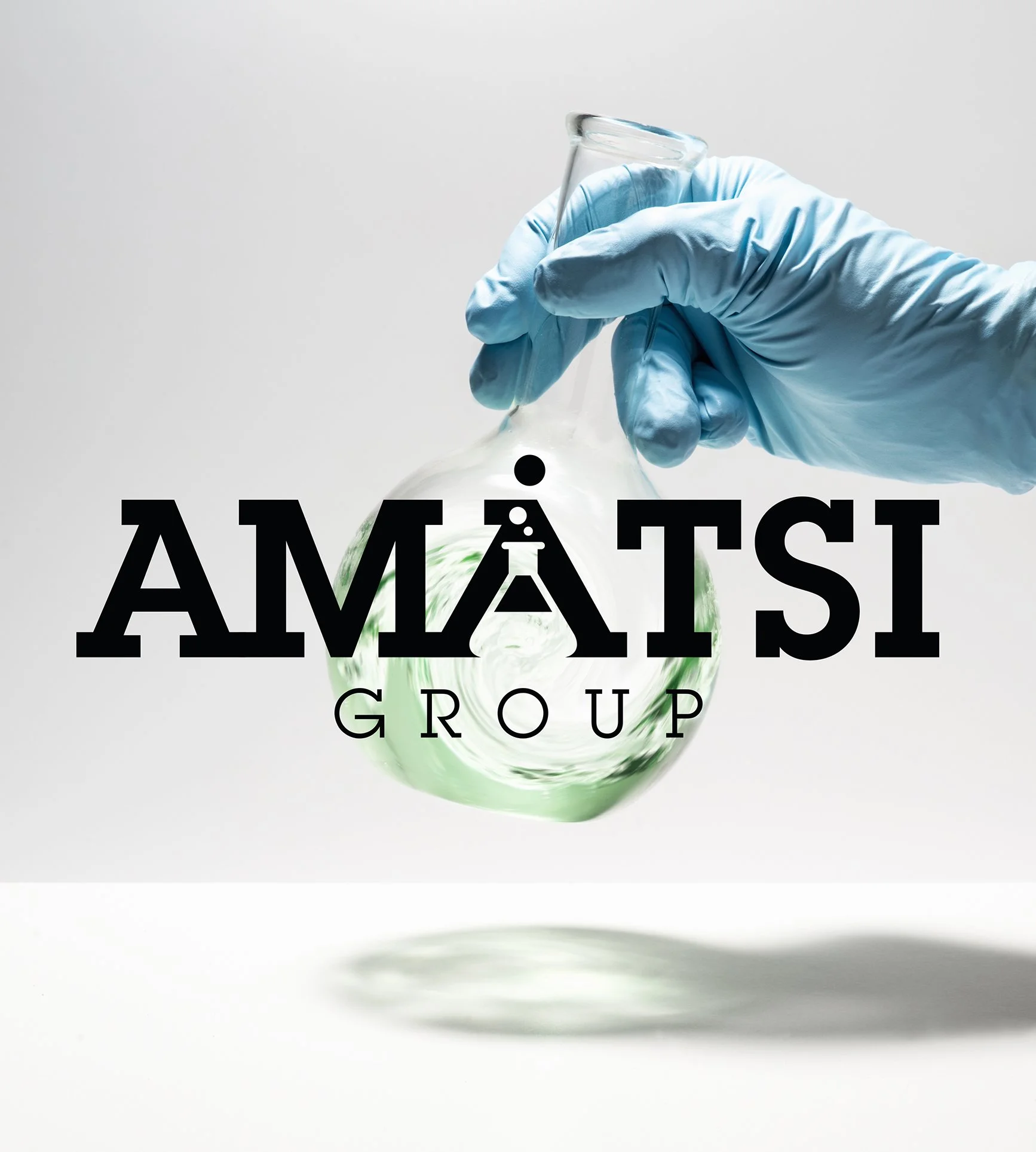
The creative solution centred on a modern visual language built from negative space, a device that brought precision, clarity and confidence to the new Amatsi identity. Paired with a clean, future‑facing photographic art direction, the refreshed logo and imagery delivered the modernity the brand had lacked, signalling a more agile, science‑driven organisation ready for its next chapter.
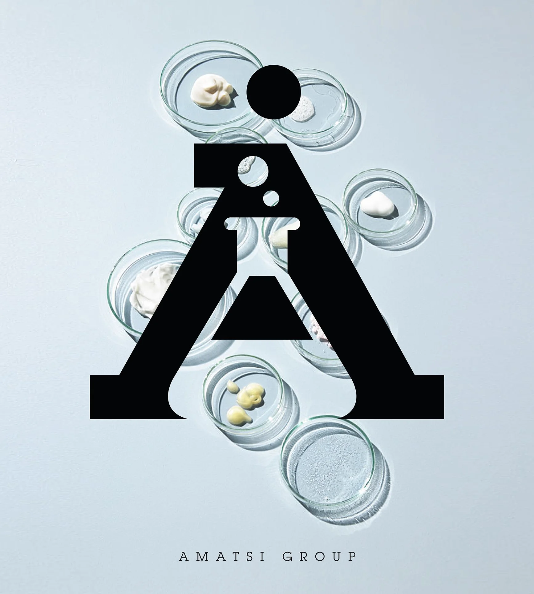
Logo designs
The Objective
During the 2020 lockdown, the LEGO Group asked us to create a film that would support staff through the stress and isolation of remote life. The strategy was to channel LEGO’s spirit of playful resilience into a simple, uplifting message — using creativity and connection to strengthen wellbeing across the organisation at a moment when people needed it most.

Creative Solution
We created Tina Tightropewalker — a light‑hearted character who personified the balancing act of lockdown life. She shared tips to stay sane, re‑energise and regain work‑life balance, turning LEGO’s spirit of playful resilience into a relatable guide. A cut‑down version was shared on LEGO social channels, becoming a warm, family‑friendly moment for parents and kids alike.
Internal Video